Polygon's MATIC token has outperformed most crypto-assets during this recent market downturn. Bottoming at $0.32 on June 18th, it has managed to increase 60% of its value to $0.50. This recent price rally was preceded by a large increase in whales' holdings, substantial exchange outflows and then followed by high activity among users holding the MATIC token.
The balance by holdings indicator, classifies and divides addresses according to their holdings. This is helpful to analyze the historical variation of the circulating supply categorized by the balance that the total number of addresses hold of that cryptocurrency. In this case, MATIC’s variation over time for the 100 million to the 1 billion can be seen.
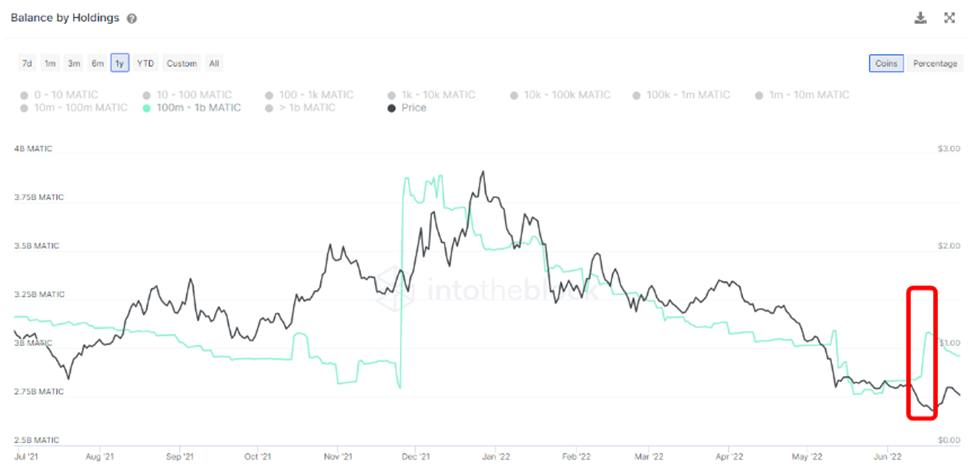
Source: IntoTheBlock
As is depicted by the indicator, following a steep decline in balance, an accumulation phase began. This can be seen on the red box. Currently the 100 million to 1 billion bracket is composed of eleven addresses, which together make up 30% of the total coin supply. This equals to 2.96 billion MATIC currently worth $2.48 billion dollars.
A previous same bracket accumulation phase had occurred in late November prior to a 30% increase in price. Later on, they began to offload their MATIC at the all-time high and consistently in the subsequent weeks. This recent 9% accumulation rally is the largest, since the one seen in November of last year. Currently a similar behavior can start to be noticed, in which large rallies are followed by small timely selloffs.
At the same time, we are seeing MATIC leaving exchanges. This pattern aligns with whales' accumulation of MATIC. For this metric, IntoTheBlock gathers addresses of the top centralized exchanges. In this way, measures the net volume flowing into exchanges by subtracting outflow volume minus inflow volume.
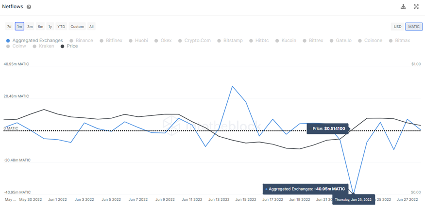
Source: IntoTheBlock
The Net Flows indicator highlights trends of traders sending money in and out of exchanges. Therefore, Net Flows are negative when a greater volume is being withdrawn from exchanges. This could be seen as a sign of accumulation or addresses buying back following large declines.
While Net Flows also affect large cap crypto-assets, smaller cap tokens are more susceptible to large changes in prices deriving from exchange flows. This is simply a result of smaller caps requiring less capital in order to make market-moving trades. As a consequence, this recent 3-month outflow high was followed by a price rally.
Another way in which the price rally was reflected is through the “Active Addresses Ratio”. This one takes the percentage of the total “Addresses With a Balance” that had a transaction. It essentially divides “Active Addresses” by “Addresses with a Balance”.
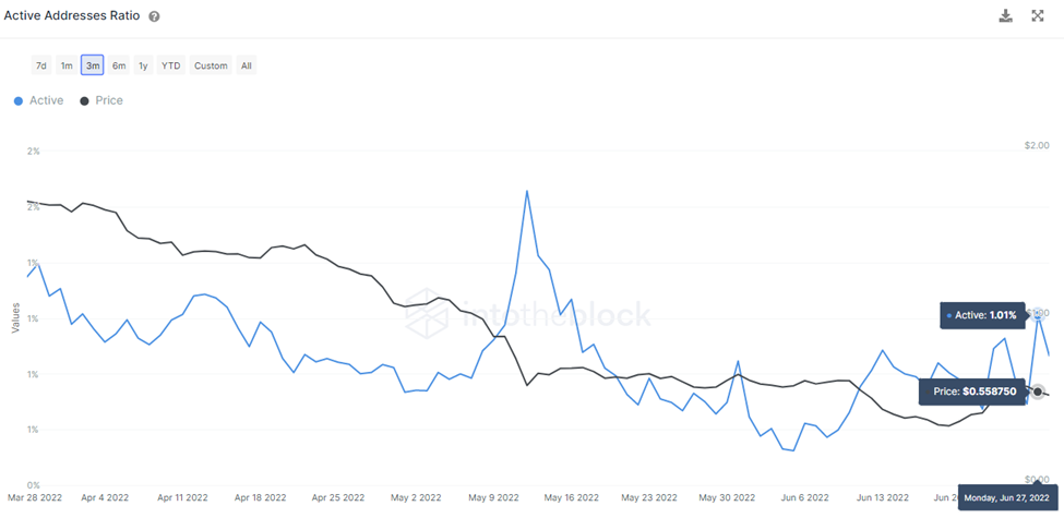
Source: IntoTheBlock
The indicator above depicts the daily percentage of addresses with a balance that has sent a transaction. As depicted above the percentage of addresses recently touched 1,01% which marks the second highest point in a 3 month period. The highest point was due to the Terra ecosystem collapse on May 13th. This indicator helps to further illustrate the user’s interest swing throughout a change in market conditions.
Overall, signs of progress and demand in Polygon continue to grow in spite of the short-term volatility and market conditions. Some claim this demand may be linked to Meta's upcoming launch of NFTs on Instagram on top of the Polygon network. While there's still price arguments, what's undoubting is Polygon’s gained spotlight among EVM side chains during this recent market retrace.